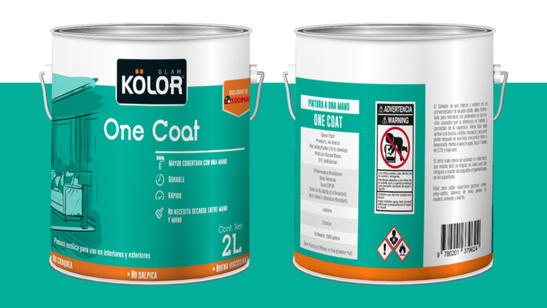
Graphic proposal of a label to market a brand of paintings in retail with four variants. We apply a color code by category to identify them but also unify them as a single brand.
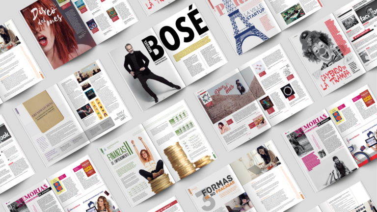
We were part of the redesign of the magazine for the entrepreneurial ecosystem in our country. Our mission was to propose a renewed graphic line for publication and replace it gradually.
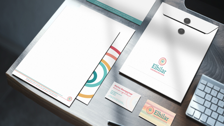
From the logo given, we developed a graphic line of communication for this educational center that not only reflects the cleanliness and sobriety of the institution, but also maintains a friendly and pedagogical image.